

User interface designs and concepts has evolved a lot through the past few years. With Web technologies advancing rapidly, it's important to maintain a smooth and appealing UI to catch the user's attention. various methods has to be adopted in order to engage the user while the site loads and here comes Skeleton Screens to the rescue. In this article, I will walk you through the steps to create a Skeleton UI using React
Prerequisites
- HTML
- CSS
- JavaScript
- React
Setting Up
Use
npx create-react-app to create a boilerplate and clear the unwanted files and contents. We will be creating an app that displays a list of posts from https://jsonplaceholder.typicode.com/posts API.
Note that few general conventions are intentionally avoided to keep it as simple as possible.
Card
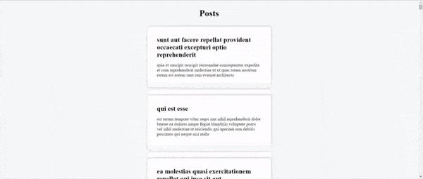
Create Card.js file inside the src folder. This component will be used to display the post details.
import React from "react";

export default function Card() {
  return (
    <div className="card">
      <h2>title goes here</h2>
      <p>body goes here</p>
    </div>
  );
}
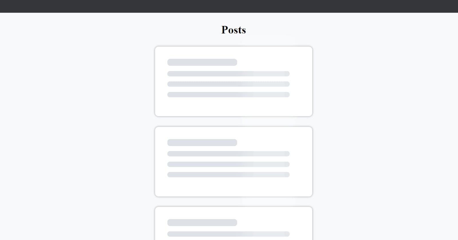
Skeleton
Create Skeleton.js file inside the src folder :
import React from "react";

export default function Skeleton() {
  return (
    <div className="card skeleton">
      <div className="title text"></div>
      <div className="description text"></div>
      <div className="description text"></div>
      <div className="description text"></div>
      <div className="overlay"></div>
    </div>
  );
}
Styling
Let's add few stylings to the components :
* {
  box-sizing: border-box;
}
body {
  background-color: #f8f9fa;
  display: flex;
  flex-direction: column;
  align-items: center;
}
h1 {
  text-align: center;
}
.card {
  width: 450px;
  margin: 30px;
  padding: 20px;
  min-height: 200px;
  background-color: #fff;
  border-radius: 10px;
  box-shadow: 0px 0px 5px 1px rgba(0, 0, 0, 0.3);
}
h2, p, .title, .description {
  margin: 15px;
}
.text {
  border-radius: 8px;
  background-color: #dee2e6;
}
.title {
  width: 200px;
  height: 20px;
}
.description {
  width: 350px;
  height: 15px;
}
Animation
The Skeleton Screen is only complete with a linear animation, so let's add a few more properties :
.skeleton {
  position: relative;
}
.overlay {
  position: absolute;
  top: 0;
  left: 0;
  width: 20%;
  height: 100%;
  background-color: rgba(256, 256, 256, 0.3);
  box-shadow: 0px 0px 20px 30px rgba(256, 256, 256, 0.2);
  animation: slider 1.2s infinite;
}
@keyframes slider {
  0% {
    transform: translateX(-100%);
  }
  100% {
    transform: translateX(500%);
  }
}
App
Now we are all set with the components. Let's import them in App.js:
import "./styles.css";
import Card from "./Card";
import Skeleton from "./Skeleton";
Let's build Logic to fetch the posts. For this we will need useState and useEffect hooks. So let's import them :
import React, { useState, useEffect } from "react";
We will need a state to store the posts. So initialize an empty array:
const [posts, setPosts] = useState([]);
Also , initialize a boolean state to keep a track on the posts array :
const [isEmpty, setIsEmpty] = useState(true);
The isEmpty variable is set to true initially since the posts array is empty.
Now lets fetch the posts :
 useEffect(() => {
    setTimeout(() => {
      fetch("https://jsonplaceholder.typicode.com/posts")
        .then((response) => response.json())
        .then((data) => {
          setPosts(data);
          setIsEmpty(false);
        })
        .catch((err) => console.log(err));
    }, 3000);
 }, []);
A 3 seconds delay is added to mimic a slow server resonse. The isEmpty variable is updated to false when posts array is populated with data. The useEffect hook is provided with an empty dependency array which corresponds to the componentDidMount life cycle method.
The final part, Let's render the components :
return (
    <>
      <h1>Posts</h1>
      {
        isEmpty && [1, 2, 3, 4].map((value) => <Skeleton key={value} />)
      }
      {
        isEmpty ||
          posts.map((post) => (
            <Card key={post.id} title={post.title} body={post.body} />
          ))
      }
    </>
  );
We render 4 Skeleton Cards if isEmpty is true. Else, we render the posts.
The App.js will look like :
import "./styles.css";
import React, { useState, useEffect } from "react";
import Card from "./Card";
import Skeleton from "./Skeleton";

export default function App() {
  //state to store posts
  //initializing posts as an empty array
  const [posts, setPosts] = useState([]);
  //state to determine whether posts is empty
  const [isEmpty, setIsEmpty] = useState(true);

  useEffect(() => {
    //3s timeout to mimic server delay
    setTimeout(() => {
      fetch("https://jsonplaceholder.typicode.com/posts")
        .then((response) => response.json())
        .then((data) => {
          //populating posts array
          setPosts(data);
          setIsEmpty(false);
        })
        .catch((err) => console.log(err));
    }, 3000);
  }, []);

  return (
    <>
      <h1>Posts</h1>
      {
        // rendering 4 skeleton cards when posts array is empty
        isEmpty && [1, 2, 3, 4].map((value) => <Skeleton key={value} />)
      }
      {
        //rendering actual cards when posts array is populated with some data
        isEmpty ||
          posts.map((post) => (
            <Card key={post.id} title={post.title} body={post.body} />
          ))
      }
    </>
  );
}
A final touch left. Notice that we are passsing props to the Card Component? It has to be taken care of. Make the following changes in Card.js.
import React from "react";

export default function Card({ title, body }) {
  return (
    <div className="card">
      <h2>{title}</h2>
      <p>{body}</p>
    </div>
  );
}
We destructured the props and used them appropriately.
And Thats it !!
Final Output